How To Use Golden Ratio in Logo Design
In this article, we will explore how you can use the golden ratio in logo design to create logos that are visually balanced and harmonious.
You’ll learn what is the golden ratio and how to draw the golden grid (with the spiral inside).
Then, I will also provide some tips and examples to help you incorporate the golden ratio into your logo designs.
PS. You can also watch this content on my YouTube channel.
Whether you are a professional designer or a business owner looking to create your own logo, I will show you how to use the golden ratio in your next project.
Golden Ratio in Logo Design:
- What is the golden ratio
- Golden ratio logo examples
- How to draw a golden grid
- Using golden ratio in logo design
- Conclusion
Sometimes I’m able to use the golden ratio in my logo design work, like for example — this one that I recently designed for SweetGrass:

First, let’s define what the golden ratio actually is and how it works.
1. What is the golden ratio?
A sequence of numbers that can be found in nature and it provides the most aesthetically pleasing proportion.
It has been used in art, architecture, and design for centuries.

If you wanna be on the same creative level as Leonardo Da Vinci, Salvador Dali, Michelangelo, or the designers of the Parthenon — Then you should learn how to use it.
Basically, it’s a proportion represented by a special number which is approx. 1.618
This number is found by dividing a line into two parts, in such a way that the long part (a) divided by the short part (b) is equal to the whole line (a + b) divided by the longer part (a).
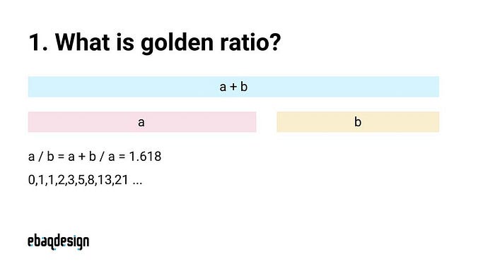
This is also related to the Fibonacci sequence, which is the sum of the two last numbers.
It goes like this: 0, 1, 1, 2, 3, 5, 8, 13, 21, and so on, to infinity…
I will explain how to draw the golden grid with that spiral inside later in this article — but first, let me show you a few examples of logos that use the golden ratio.
2. Golden ratio logo examples
Let me give you a few examples of famous logos that were created by using the golden ratio.
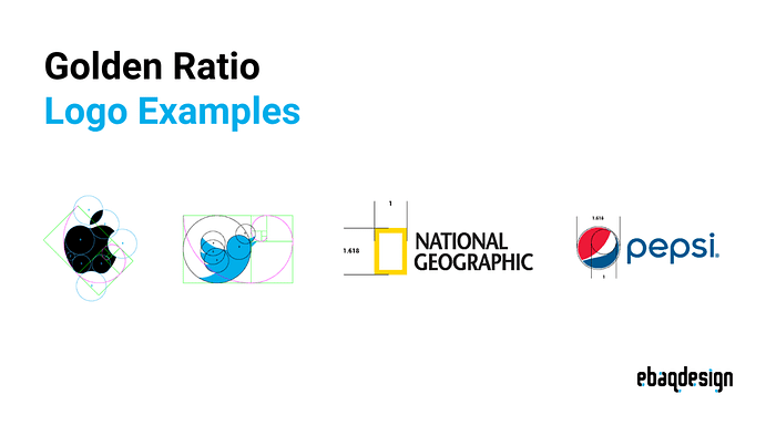
Apple logo
Firstly, the shape of the Apple logo was drawn by using golden proportion.

The lines, curves, and proportions were created by using circles from the golden grid.
Twitter logo
Twitter logo is probably the most famous example of a logo that uses the golden ratio.

All these curves: including the bird’s feathers and the body were created by using this rule.
National Geographic logo
Even the National Geographic logo uses this special proportion to create that famous yellow rectangle.
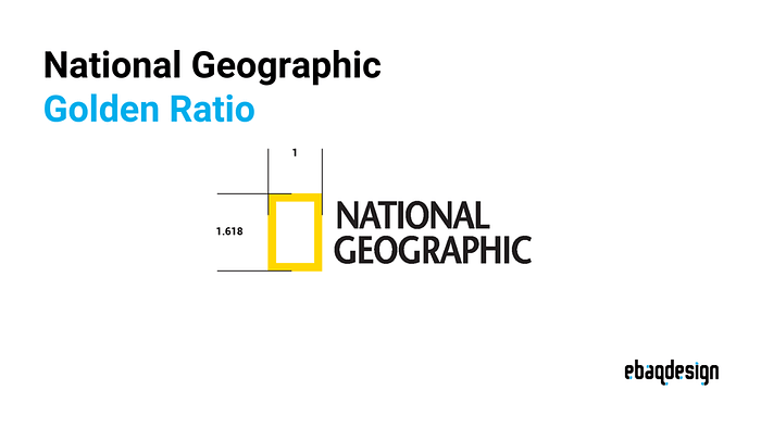
You can use the golden ratio not only to establish the proportion within the elements of your logo but it can also be used to position elements relative to each other.
Pepsi logo
Similarly with Pepsi, where those two circles — the outer and the inner circle appear to be drawn using the golden mean.
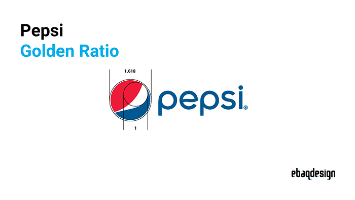
As you can see in the examples above, even the simplest logo can be drawn with the golden proportions in mind.
3. How to draw a golden grid
Now, let me show you how to draw the golden ratio grid in Illustrator.
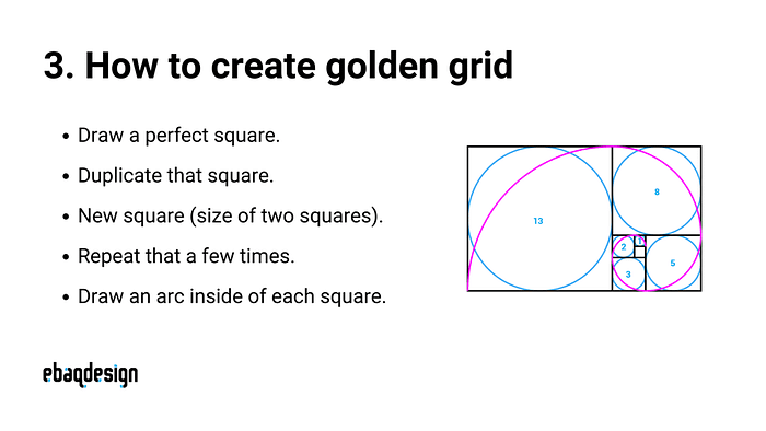
Here’s how to create a golden grid in 5 easy steps:
- First — draw a square.
- Duplicate that square (move anti-clockwise).
- Create a square in the size of the two previous ones.
- Repeat that a few times until you get desired size of the grid.
- Draw an arc inside of each square to create the logarithmic spiral.
Next, let me show you how to actually use it.
4. Using golden ratio in logo design
One way to use the golden ratio when designing logos is by using the shapes from the grid to construct your designs.
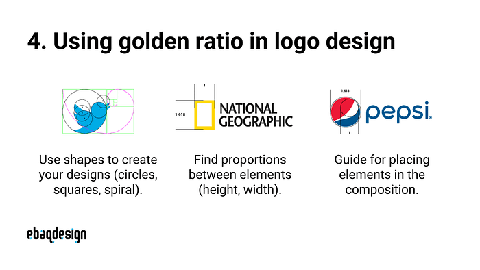
You can take these shapes rectangles or circles of different sizes and then re-use them to build your logo.
Another way to use it is to simply find the right proportions of the elements in your design (width, height).
Yet another way is to just use it as your guide to placing elements within your composition.
Conclusion
It’s important to note that the golden ratio is just one tool that can be used in logo design.

Don’t force it! — Because maybe the rule of thirds will work better for you.
Or maybe an absolute symmetry will work best for the type of logo you’re designing…
So it’s NOT necessary to use it in every single design — It’s just a helpful guide to creating a more balanced and harmonious design.
I hope you learned something new today.
If you’re looking for a logo designer, then shoot me an email.
